I don’t feature football shirts probably as much as I’d like to, but the Inter Milan 4th shirt for 2020-21 is one of those I couldn’t resist featuring. It’s epic!
When it comes to crazy football kits, we’ve had a few in recent times. It feels like that the crazy mad cool designs which we’ve seen back in the 90’s could be making a come back, at least in the form of 3rd or 4th shirts.
Fashion and football are sometimes poles apart, but since streetwear and sportswear is cool again, it’s been the perfect time for the sportswear brands to capitalise and release some sought after shirts.
When it comes to Adidas vs Nike, I have to hand it to Nike, and think over the past couple of years they’ve created the best looking and most interesting designs.
OK, so now on to the Inter Milan shirt…
The Inter Milan 4th shirt’s design is inspired by one of the club’s founders and futurist artist Giorgio Muggiani. It features a white base, with the Inter Milan traditional home colours of blue and black being in the design, as well as a lot of yellow being used.
The design and pattern is crazy and random, there’s really no explaining it other than saying it stands out a lot.
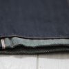
The front lower section has a 90’s style printed pattern on one side, with blocks of colour to the other. The sleeves are asymmetrical in design, with one being solid yellow, and the other having a blue and black pattern.
The front sponsor logo (Prielli) is written in a vertical orientation rather than the standard horizontal placement, under the Inter badge. These are both in yellow on a black stripe, with the design giving off a layered look with a blue stripe being behind in an offset manner.
The Nike logo is on a blue and black striped background, with more yellow and white patterns in the upper section of the shirt.

It’s the same crazy story on the back, with the same colours used but in a different pattern. There’s a large blue and black rectangle which looks like the placement for the name of a player, with most of the middle of the back blank white, the placement for the number.
There’s small blue, black, and yellow squares in the design, and at the base there’s a diagonal split of yellow and black colour.
What do you think of this design?
I really like it. It’s original, different, colourful and distinctive. It’s done in a way which incorporates a lot of colour, but retains the branding of the club. Sometimes with a lot of design and colour it’s really easy to get wrong, but I think this design gets it right.
I can’t wait to see this in action, but we may never see this shirt on the pitch at all. Serie A has a rule which states that a shirt can only contain “a maximum of 3 distinct colours”, with this shirt containing 4. (Interestingly Sampdoria’s iconic design contains 4 colours which they can use)
If you like it, you can get the stadium version for £70 at Nike here, or get the Match Vapour version for £105.
Images via Nike

About Michael
Michael Adams is the founder and editor of Michael 84, blogger from Newcastle, UK. Sharing men's fashion tips, style advice and lifestyle information for all guys.